
Lest I be burned at the stake by a ferocious pack of Excelites, I begin with the following admission: I am a newbie when it comes to Excel. I write this blog partly to get constructive feedback (should anyone have any), and partly to help anyone who might struggle with a similar problem and who might receive some modicum of joy from this method.
The Probelm
First, let me define a problem: You have a backlog that contains work which is categorized in some way. The categories might be "sub-projects", "feature sets", or similar. You want to get a picture of when a particuar category is going to be worked on, or when work overall on a particuar category is going to be done. Furthermore, you don't just want to know, you want to be able to make a big, visible chart out of the data.
This excercise was in part inspired by this blog post: Is the Gantt Chart Useless in Agile Projects? written by Michael Cardus on Jurgen Appelo's Management 3.0 site. That post deals specifically with Gantt charts in Agile, and a Gantt chart wasn't exactly what we needed, but is quite similar. So the "literature", so to speak, on doing Gantt charts in Excel should prove useful.
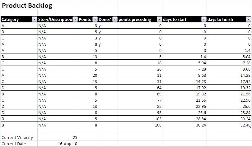
Let's say your backlog looks like this:

So, we have four categories with various stories which have been put in a completely random (uh, I mean very sensible and thought-out) order by the Product Owner. Each story has a size. We also (and maybe not everyone does this) keep old backlog items around and mark as "done", so we'll need to take that into consideration.
Let's also assume that using Excel is a requirement. Please don't question this requirement; I did, and my arse still hurts from the spanking.
The first thing I did when trying to "solve" this problem was to try a load of various ways of summarizing the data and visualizing it with built in Excel chart tools. Once I managed to reinsert all the hair that I had pulled out of my head (actually, there's still a spot on top which isn't covered and I'm pretty sure that wasn't there before ;-), I eventually settled on this method: Convert the story points to days based on velocity, calculate the work activity on a per day basis, then use a stacked bar chart to visualize.
Let's look at those steps individually:
Step 1: Points to Days
Now, I know what you're thinking: story points are not a measure of time! Yes, but that doesn't mean to say that we're not allowed to use our average (and worst case) velocity to make loose predictions for release planning purposes. Work with me here, I'm pretty sure I'm not violating some law of Scrum physics that's going to open up a hole in the Points/Time Continuum.
The way I did this conversion was to use a few hidden columns in the backlog to show "preceding points" for each story (i.e. story points up to this story in the backlog which were not yet complete), as well as "days before" and "days at completion" both based on velocity.
The formula for getting the preceding points was a bit tricky. To sum the "undone" work in the backlog that precedes this story:
{=SUM(IF(($E4<>"y")*($D4>0)*($E$4:$E$14<>"y")*(ROW($D$4:$D$14)<ROW()),$D$4:$D$14,0))}
Where D is the Points column, and E is the Done? column.
It's an array formula (a key fact: look up array formulas if you don't know about them, they're quite cool) that basically looks at the whole table to get points for stories where "Done?" is not "y" and the row number is less than the current row number. Looks easy in hindsight, doesn't it!
Note that the "*" is how we "AND" conditions in an array formula. Excel's "AND" function won't work here.
The next two calculations really are easy.
Calculate the number of days until this story will start (based on current velocity):
=($F4/($C$23/7))
Calculate the number of days until this work will be complete (based on current velocity and story size):
=IF($E4<>"y",($F4+$D4)/($C$23/7),0)
Where F is the "preceding points" column we calculted above, C23 is the average sprint velocity and 7 is the number of days per sprint.
Now, with those columns unhidden, the backlog looks like this:
So, with that chore out of the way, let's talk about what we want this graph to look like. I always find with Excel that it's easier to think about what data you need to create a workable chart first, and then format the data accordingly. It's too easy to disappear down a rabbit hole if you take what seems to be sensible data and try to make the chart fit *it*.
Ultimately, this is what we end up with (what we are going for):

The Gantt chart literature made it quite clear that a stacked bar chart would be our friend. I played around a bit with line charts and scatter plots, but nothing worked quite right. One thing that slightly bugs me about Excel is not being able to do a chart which is categorical on both axes. If that were possible then a mapping of our categories to a Sprint date (or Sprint number) would be relatively easy. I'm sure there's a mathematical reason for it (surely there's a reason for everything Microsoft does?), but Excel only supports value/value (scatter plot) and category/value (everything else).
Step 2: The Chart Data
Now this is where it gets ugly. How the hell are we going to get a chart that looks like that from our data? Turns out, it's pretty easy if we just stop thinking about it and lay the data out in the dumbest way we can think of! (I've always had this theory that computers are really, really dumb, and programmers are just people who are good at breaking stuff down into simple instructions that make sense to a dummy!)
Take a look at the picture below to see how this was done. Better yet, download the spreadsheet here.

Note: the pic doesn't show the whole thing. There is data for every day that we want to show (42 days, or 6 sprints of 7 days, in this case).
So, literally, there's a column for every day, and there's a cell for every category/day that has a 1 or 0 depending on whether there is work in that category for that day. The formula looks like this:
Determine if this Category on this Day contains work (show 1 or 0):
{=SUM(IF((Table1[category]=$U5)*(Table1[done?]<>"y")*(V$3>=Table1[days to start])*(V$3<Table1[days to finish]),1,0))}
Where U is the Category column, and V3 points to the day number of the current column.
So, basically, for all items in this category: is this day in between the start and finish day of these pieces of work?
The "1" actually creates the "height" for our bar in the graph. The trick here is the use of the inverse items (blanks) to fill in the vertical space below other categories. The "blanks" are just set to "No Fill" in the chart, so they are literally blanks.Figuring that one out was my proudest moment using Excel to date (OK, you caught me, I'm easily impressed).
A few other bits of trickery: eliminate gaps in bars so they look continuous; set horizontal axis major unit to 7 for sprint dates; delete left axis; delete "blanks" from legend; and we're done!
So, please download that spreadsheet and use this if you like it. Or, if you have a better idea, I'd love to hear it!
'Bye for now...
No comments:
Post a Comment